But in the meantime, I am making other, more straightforward years.
(Damn! Did I say straightforward?)
I have a thing about the weekly grid. It's most often wrong in other calendars. My week does not start on a Sunday. It never did. My week ends on a Sunday. It starts on a Monday. So I was always rather disappointed that the powers-that-be dictated a design that forced me to constantly self-edit when making plans. There's a J-pattern our eyes have to trace when tallying up weekly or weekend plans, "Go thus far, then check out the first block of the next line, please."

When I started managing the radio station, I was handed a lovely (not the least bit decorative) advertising calendar from our ad agent and my mind was blown. It turns out that it's not the LAW that calendars have to start on Sunday!
So, of course, the moment I was given the chance to make my own calendar, I set out to make a grid that began on Monday.

My Graphic Design instructor was not very encouraged, even after I explained the benefits of a Monday-Sunday grid. "People are used to the other way. They'll get confused."
"Okay. I know, I'll put a big space between the five days of the week and the weekend. This will highlight the two best days and remind people that they're different from work days."

"Their eyes will just track over the space. It won't look different enough."
(sigh)
And thats why my grids all have a big foggy MONDAY going down the left side of the grid. Yes, it tells you it's Monday. But it also tells you that it has to tell you this, because you're head is foggy.

My first calendar was based on my photography. I picked photos I thought meant something to the time of year.
It was a nice calendar, but very soon after I put it out, I encountered a process that has pretty much stolen my entire attention.
Papercut art is just fascinating. I think I like it for how it strains against imposed limitations. I don't know. Maybe it's because paper doesn't give me the splinters that woodworking did. I but my mind runs through endless mazes of possibility thinking about how layered 2D designs make interesting 3D shapes, landscapes and mysteries.

My first foray into paper cut calendars was with the Paper Kaleidoscope. The concept behind it was that each month was an individual pattern cut in a separate colour. There was a lot of negative space cut out of the pattern, letting the viewer look through to the next layer (and then next and next for 12 months and a cover). In January, the first colour and pattern were prominent, but when February came, January didn't disappear, it flipped around and became a background coloured pattern. February followed this in turn. What happened over the year was that a new "picture" appeared for each month, a fresh tumbled set of colours, just like inside a kaleidoscope.
I'm not done exploring that. I wanted to look at how mandalas worked and see if my art could speak as a year-long mandala. There were patterns I wasn't able to use in the kaleidoscope that would sing in a mandala.

I started work on a calendar called "At the Lake" which was a series of twelve views of a lake at various times of the year. But my notions make for complicated design and cuts. That calendar is not yet finished and it's been a year and a half.
Seriously, at 8 inches across for the design, this shack becomes an inch or so tall. Look at the itsy lines in that thing! They do not cut out easily. But I love them lots. I need to work on a bigger canvas…or simplify the shack. We'll see.
 Meanwhile, this fall, I put together a calendar along the same lines, but with some much needed divisions that make the design easier to deal with. I broke the year into four, with a solid image falling behind every third month. That meant I was only dealing with three layers and could start fresh right afterward. Really, years are set up for this anyway with seasonal changes. So my name for this calendar became quite simply "Seasonal" (I know, not a creative name. It's a working title. I'm wondering how much people care, anyway).
But, hey, I'm still a storyteller. I saw the year progressing along in a theme and my art started to take on the story. It's not a complicated tale. I think it's more cute than anything. I can't describe it here, because there are little surprises in it and I don't want to spoil them for you if you ever decide to buy one of my calendars.
I am going to show off a little bit of the calendar, though. It's fairly handsome.
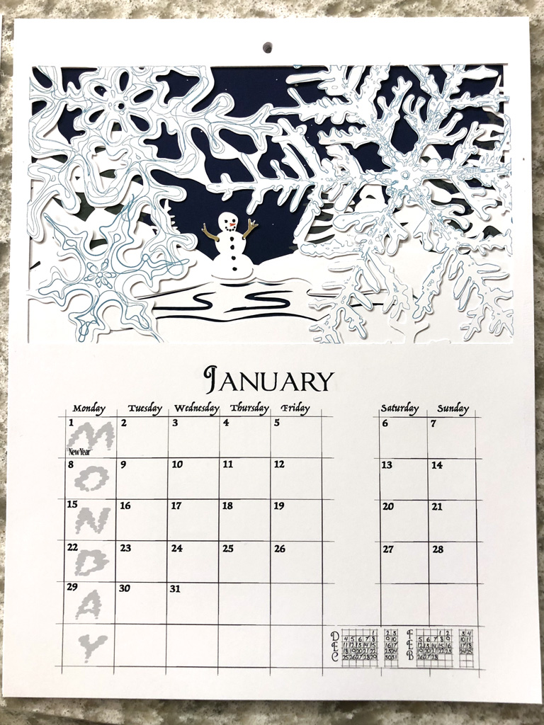
January here was originally going to be one big flake. But stories don't get told with big flakes taking up all the room, so we go with this mess-o-big-flakes notion, instead. I drew them from magnified pictures of real snowflakes. It floors me that we can see snowflake structure. I have a photo of a flake captured in a bead of water that I took one March morning while standing on the back deck of a house in downtown Fredericton.
Anyway, in this shot, you see the flakes of January, and beneath it, a snowman in February and a few of the snow-laden trees of March. The snowy night sky behind is the barrier between March and April.

April is a dense layer, with just a few cut-outs. I needed it to be rainy and the image behind June is a bright sunny morning. There's some cut-outs that go only to May, where huge pink flowers dominate. In April, the smaller hedge flowers borrow their colour from the giant petals below.
There had been a lot more cut-out of April, but the lines were too small and I felt it was better to use colour and inked lines and limit the cut-outs to shapes that would work with this.
Speaking of April. This was not my first design (I'm not sure it was my second, either). I had wanted to use a lot more of the colours from the pages below, so my first thought was multicoloured easter eggs. I spent a lot of time working out the math for that design, getting the cuts lined up just so, making use of the long petals of May's echinacea flowers.
Well, after all that work, I came to my senses: Easter was at the beginning of April, would come and go quickly and the image would be irrelevant.
Fine.
I kept the design, though. I will use it some other time. That's a lot of detail in those eggs. And I think that the bunny ears playing off the petal shapes was really neat.

I would love to see the photo of the snowflake with the water droplet, can you send it to me?
ReplyDeleteI will enquire of the owner (Di's pretty posessive XD )
DeleteAs I’ve told you before your calendars are wonderful! How are you doing the cutting, surely not by hand?
ReplyDeleteThank you!
DeleteI have a cutting machine. Even with that machine, and an efficient process, it's still about 3 hours per for the Seasonal calendar. And now (sadly) that calendar has busted my cutter. I had to stop production altogether. I'm not cutting anything for the next while. :(
This comment has been removed by the author.
ReplyDelete